
It has been a hectic week at Portfolio Charts, and if you haven’t visited recently you’ll find a pretty significant update that should keep you busy for a while. Portfolios are what we’re all here for, but any good chef knows that even the best recipe won’t get you very far if you don’t understand how to select the right ingredients. So who wants to learn more about assets?
As a habitual collector of data with a strange obsession with all sorts of obscure international asset classes, assets are kindof a moving target for me and the options have grown significantly from when the site started. From maybe two dozen asset options a few years ago to more than 65 (and growing!) today, keeping track of them is hard enough on my own and is even more challenging to sort in a useful and productive way for everyone else. The Assets section is my effort to help navigate all the different acronyms, definitions, and index fund tickers but to be honest it has been a little neglected compared to the rest of the site.
Well that has been remedied! The new Assets section was a ton of work to put together but hopefully should be a lasting framework that can grow and evolve as I continue to update the tools with interesting new data. Let’s give it a quick walkthrough so you can understand what to expect.
As a quick case study, let’s say you live in Germany and are on the market for a European small cap blend stock fund. Good choice! So let’s go to the Assets page to find one.
The first thing you’ll notice is that the main Assets page looks a lot different than before. To help navigate the ever-growing haystack of asset options more easily, everything is now primarily sorted by region. Here you can find domestic assets for individual countries, international assets for broad regions, and real assets that are generally less about regional financial securities and more about the overall market for tangible stuff.

We’re looking for a Europe fund, to let’s click the icon for EUR and see what our options are. The page is divided into several sections, and the first thing you’ll see is a world map.

The country coverage is designed to provide plenty of detail for every country covered by a particular fund. We’re clearly in the right spot, so let’s check out the Asset Class section.
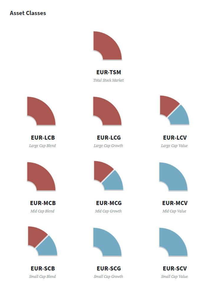
Users of the old Assets section should find the puzzle pieces familiar, but you’ll notice an interesting new twist. No longer are the asset classes universal, as they’re now individualized per country and follow the same naming convention that has been used in the Portfolio Finder for a while now. EUR-SCB represents Europe Small Cap Blend, so let’s click that and see what we find. There’s a lot going on, so let’s take it one section at a time.
First, you’ll find an overview of the asset including how it’s defined both from a market and data perspective. And if you’re interested in how the same asset looks in other regions, there are also plenty of links to quickly get you there.

Next is my favorite part. If you guessed it must be a chart of some sort, you’re on the right track. The Assets section back in the day used to have nice Heat Maps to help you visualize how individual assets performed in different historical timeframes, and I loved how that allowed you to think of them like LEGO pieces for intelligent portfolio construction. What I didn’t like was the effort required to make all of those images, and the ever-growing number of assets drove me to remove those charts from the site. Well, I’ve learned a few new tricks over the years and figured out how to not only bring the Heat Map back but also create an entire dashboard of different charts appropriate for studying individual assets on normal short-term rebalancing timeframes.

Pretty cool, right? Visit the page for yourself and you may notice that the charts are set by default to crunch EUR-SCB for investors in the United States, but set the Home Country to Germany and everything is automatically translated to Euro and German inflation. And if you’re wondering what the various unusual coloration on the charts mean, there’s info about that as well. It’s all about data transparency, and each asset may have different notes like this:

Want to know how expert investors put Small Cap Blend to good use? Scroll all the way to the bottom, and you’ll find links to every portfolio on the site that uses SCB in some form or fashion. They’re not exclusive to Europe SCB, but depending on how you plan to build your portfolio I imagine you’ll find them all educational.

And finally, since we’re looking for a EUR-SCB index fund let’s take a look at the list of options. While the list is not comprehensive, I’ve taken the time to scour each home stock market for real-world index funds and sort them by some of the most popular fund providers. In this case we want a fund for a German investor, and there are three options worth adding to your list for consideration: SXRJ, SPYS, and DX2J.

So in a few short clicks, interested investors can find index tickers for any regional asset class traded in a particular market while learning a bunch of useful data along the way. Each asset page is designed to be an information-dense resource to help study an index ingredient and really know how it might fit in your personal portfolio recipe. Now multiply that by 65 assets and you’ll see why I’ve been so busy lately!
Speaking of portfolios, having all of these assets just a link away also comes in handy when referencing investing ideas. The asset allocation for each Portfolio is now no longer a simple list but a full table that not only details the asset assumptions built into various portfolio translations but also provides quick links to each asset. For example, here’s the Asset Allocation you’ll find listed for the No-Brainer Portfolio. No matter what country you live in, details on each portfolio asset are just a click a way.

One of the fun things about running a constantly-evolving site like Portfolio Charts is that I also learn a lot of unexpected things in the process. A good example is this asset allocation table. While making tools that quickly and consistently translate portfolio ideas between countries is a really fun challenge that I embrace, the process of creating links for every portfolio asset highlighted for me how some of the assets that the tools automatically choose frankly don’t make a lot of sense in some situations. I already have some ideas on that front, but in the meantime please don’t take the list of assets as gospel and feel free to make liberal use of the My Portfolio tool to tweak any portfolio idea in any way you like.
Do you feel inspired yet? Good! Put on your portfolio chef’s hat and start researching some ingredients. Learn and experiment for a while, and you’ll be surprised how quickly you get the hang of how different assets interact and combine to become a portfolio greater than the sum of its parts. So stop eating so much financial takeout and start thinking for yourself! Once you learn to cook, you’ll never look at individual index funds the same way again.