
I’ve flown a lot over the years, and I understand first-hand how all of the little details like packing, efficiently getting through security, and getting settled on the plane become so routine for frequent travelers that they can do them without even thinking. But occasionally life throws you a curveball, just as it did on a recent flight where I was without my normal headphones. Stuck for several hours with nothing but the drone of the engines to keep me company, I can’t say I was thrilled but it turns out it was just the inspiration I needed to explain a complicated concept:
How do consistent portfolios full of volatile assets actually work?
Sure, I could go into a detailed discussion of covariance, standard deviations, and the complicated math behind efficient portfolio construction, but frankly I know I would quickly lose most people and even bore myself in the process. So inspired by the the desire for silence I normally take for granted, let’s step back and think of the problem a little differently in terms we can all relate to — noise.
The Signal in the Noise
Every sound you hear is a pressure wave that propagates through the air from the source to your ears. If you were to draw it on paper that wave might look something like this:

Now there are several characteristics of sound waves we could study, but for now let’s keep it very simple. See the “V” that measures the distance between the peak and the valley? That’s the sound volume. The larger the wave, the louder the noise.
While the loud roar of an airplane engine may seem like a wide departure from finance, the interesting thing is that sound waves and asset returns actually share a lot in common. Let’s take a look at a chart following the annual real returns of the US stock market since 1970:

Not seeing it yet? No worries. Here is the exact same data in a slightly different format.

It may not be as clean as the idealized sound wave, but with so many alternating peaks and valleys I’m sure you can see the resemblance. And in this context that “V” has a second meaning — volatility. The distance between the highest peak and lowest valley is about the clearest picture of volatility as you’re ever going to see, and conceptually it can be directly compared to sound volume. For a very different example, here’s the same chart for peacefully quiet TBills:

The fun part about thinking of portfolios in terms of sound waves is that we can also apply a few tricks from the headphone business to improve the quality of the sound. When someone flying on a plane wants to reduce the noise they hear from the engines, there are two popular strategies we can learn from — noise dampening and noise cancellation.
Noise dampening is how earplugs work, and the idea is to simply block out as much noise as possible. The investing equivalent of using earplugs is to stuff your portfolio full of low-volatility assets like cash.
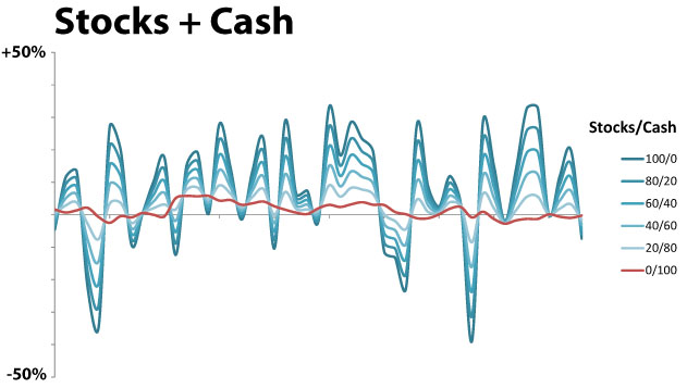
This chart illustrates the “volume” of a variety of portfolios with different percentages of stocks and cash. To avoid confusion with another investing concept by the same name, let’s call it “intensity”. I’ve highlighted the lowest-intensity portfolio in red, and not surprisingly it’s the option with 100% cash. Since stocks are what drive returns in this portfolio, much old-school investing advice thus comes down to determining your “risk tolerance” which basically means figuring out the loudest portfolio you can tolerate before you simply can’t take it any more.
But that’s not the only way to reduce noise either on an airplane or in a portfolio, and that’s where noise cancellation comes in. You know those fancy noise cancelling headphones that magically reduce noise at the press of a button? They work not by blocking noise but by actively cancelling out one loud noise with an equally loud one. It’s all about the timing.

If the blue-green line is our original sound wave, the black line is the noise that the headphones generate. Sound waves are additive, so the red line is what actually reaches your ear. That silence has a lot more action going on behind the scenes than you realize!
Just like sound waves, asset returns are also additive. So to apply noise cancellation to portfolios the trick is to find an asset just as volatile as stocks that doesn’t follow the same pattern. One good example is gold.

This is where it gets kinda crazy, as the idea of mixing two highly volatile assets in order to reduce volatility seems very counter-intuitive. But watch what happens:

Now it’s certainly no perfectly flat signal by any means, but check out the red line. Unlike the previous version with stocks and cash, the lowest-intensity portfolio is not 100% of the lowest-intensity asset. It’s somewhere in between, and the resulting portfolio is actually much more pleasant than either contributing asset in isolation.
Of course, it gets even more complicated once you start adding in more assets. For example, here’s the same chart that shows the Golden Butterfly annual real returns compared to each underlying asset — total stock market, small cap value, long term bonds, short term bonds, and gold.

With four highly volatile assets out of five, someone only looking at the ingredients might naturally assume that the Golden Butterfly is a highly volatile portfolio. But nothing could be further from the truth. The final recipe is much less intense than any lone ingredient, and wild swings in each asset are to be embraced rather than feared because that’s actually how the portfolio works to stay balanced.
Long story short, that’s noise cancellation applied to portfolio theory. An intelligent investor who understands this concept can use it to mix a variety of asset noise to produce a combined portfolio signal much less intense than any individual asset.
A New Tool for a New Concept
If you find this idea as fascinating as I do, I’ve got a little surprise for you. I had a lot of fun making that last chart, so I cleaned it up and built a brand new calculator. Playing on the sound theme and the obvious visual parallels, I call it the Equalizer chart.

In addition to illustrating how each asset in a portfolio performed relative to the portfolio as a whole, the Equalizer chart includes a few more stats to help you compare the quality of the signal.
Intensity works like sound volume, and it measures the total spread between the max and min portfolio returns on record designated by the blue and red dotted lines. Each level of intensity represents an additional 10% spread in returns. I realize that sometimes a portfolio might contain what you consider to be an outlier, so I’ve also included a setting to filter out any number of high and low data points you like.
One more similarity between portfolio waves and sound waves is that not every wave is equally unpleasant. Studies have shown than low frequencies are less irritating than high frequencies at the same volume, and I don’t need a study to tell me that sharp portfolio gains are much more desirable than sharp losses. Along those lines, balance is a measure of the difference between the high and low extremes. Balance of zero means that the highest gains were the same magnitude of the deepest losses. Balance of -3 would mean that the portfolio losses were somewhat more intense than the gains. And a theoretical portfolio with a balance of +10 never experienced a single down year. Let me know if you find one of those!
But beyond the stats, the thing I like most about the Equalizer chart is all of the gray lines. Look at a few charts and you’ll learn more about complex things like asset correlations than you will in an entire course of equations on the subject. For example, check out the Equalizer chart for both the Golden Butterfly and the Merriman Ultimate portfolios.

See how the lines for the Merriman Ultimate portfolio often move together? That’s a visual representation of highly correlated assets, and you can see how they tug on the portfolio in unison during big market swings. In contrast, do you notice how the Golden Butterfly assets look more like an unpredictable mess with many spiking at the same time that others crater? That’s what uncorrelated assets look like, and it’s how the Golden Butterfly pulled off lower intensity and higher balance with plenty of volatile assets of its own.
So as you play with the Equalizer chart, I encourage you to not only study the numbers but also look at the big picture. Sure, low intensity and high balance is something we all would like in a portfolio. But really look at all of the wild gray lines and think about just how unimportant they are in the grand scheme of things. I hear so many people stress and argue about individual asset returns in a portfolio, when compared to the total portfolio the very high or low returns for those assets in any given year are nothing to worry about if you chose them for the right reasons. Think about adding an asset for the signal that desirably shapes your portfolio sound wave, and you’ll start to appreciate the assets for what they are rather than letting the markets drive you crazy. And in the process, you’ll graduate to the sweet headphones with great sound that you always wanted.
The style is up to you, but the idea is the same. Learn how to mix the right portfolio and everything else is just noise.
Did this help you understand asset allocation from a new perspective?