
Interviewing contractors to work on your home is an interesting exercise in managing expectations. Purchasing a product where you know exactly what you’re getting ahead of time is a lot different than purchasing a service where the end result can never be fully appreciated until the work is complete. Who you choose to do the work thus becomes the most important step, but it’s also the trickiest to navigate.
The salesmen dress in their finest clothes and are on their absolute best behavior, and they all claim to have a glowing track record and seem to be very capable. You know intuitively that not all companies can be above average and that some crews are measurably better than others, but looking at their finely curated portfolios of their absolute best work it’s sometimes hard to tell the truly talented craftsmen from the ones who only talk about their few successes.
Without the benefit of a crystal ball to see all the surprise issues they’ll have to navigate on your project and how they will react, the best one can generally do is study the history of the company and check their references. By gauging how consistently they delivered what they promised and exceeded customer expectations over time, one can learn something about their character and gain enough confidence to hand over your hard-earned money to a company with a trustworthy reputation.
There’s a similar issue in investing, although the stakes are even higher. Evaluating where to invest your life savings is a critically important exercise, and there’s no shortage of people looking to tell you about their favorite method with a fantastic track record. But in investing, timing is everything — by the time you’ve heard of the hottest new asset allocation, it’s probably because it has already peaked. Buying what has recently performed well may actually lose money more often than not.
Now does that mean that all backtesting is like shady salesman that only tells you about his best work to extract you from your money? Of course not. While uncertainty is an inseparable aspect of investing, some portfolios are more consistent than others and are measurably better at meeting expectations. Of course, the trick is in identifying them ahead of time.
How might we do that? Let’s check their references and see how often their final performance matched their quote.
Any time you research a fund online, you’ll inevitably run across a returns summary that displays the average return for the last 1, 3, 5, and 10 years. For example, searching Fidelity for a large cap blend fund with low fees generates the following list:
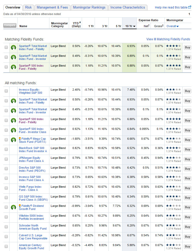
Most brokerages are set up to compare funds exactly this way with fancy sorting tools to identify investments with the best recent track records, but they offer no true sense of practical history that discusses how often the results met previous expectations. It’s very tempting (and actually encouraged by the user interface) to sort the 10-year returns from best to worst and to buy the best one. But which of these funds have been truly dependable, and which just happened to be lucky the last ten years?
Think of this list as what you get if you only compare contractors by their single most recent project. It’s easy to sort them by what you like best, and but that says nothing about what they told other potential customers regarding performance and whether the end results consistently met expectations. For all you know, the best companies just finished building a boring but exceptionally-built woodshed that didn’t catch your eye while the worst made the fancy kitchen you fell in love with by lucking into materials that they no longer have access to or that broke right after the picture was taken.
So for a moment, let’s put ourselves in the shoes of an investor browsing for the same fund many years ago. For this example I’ll focus on the highlighted one in purple — a popular S&P500 fund that very closely corresponds to the large cap blend category on this site. What might the trailing 10-year returns look like at different points in history? More importantly, how did it perform in the subsequent ten years compared to expectations?

Previous 10-Year Returns vs. Following 10-Year for Large Cap Blend
The red line tracks the previous 10-year inflation-adjusted CAGR for each point in history. So if you were browsing for a large cap blend fund in 1999, the 10-year return you would have seen in fund literature was north of 15% a year (perhaps even higher since this chart also accounts for inflation). The blue line shows the 10-year inflation-adjusted CAGR from that year forward. So a person who purchased this fund in 1999 actually experienced a 10-year loss of -4% a year!
The difference between the backward-looking returns and the forward-looking returns is where expectations come into play. The 1999 investor rationally used the longest timeframe available to make their decision, and likely expected returns to at least be in the same ballpark as what was advertised. However, the returns they actually received were a full 19% worse a year. To say that the investment did not meet expectations is… well… putting it kindly.
Fortunately, not all portfolios are equally untrustworthy. Just like some contractors are more dependable than others, some portfolios are as well. To help study the differences in more depth, I’ve added a new tool to the site — the Start Date Sensitivity calculator. Here are the results for the same Large Cap Blend portfolio compared to the famously dependable Permanent Portfolio.


Beyond the chart itself, I’ve included three data points to help quickly track the highlights. The biggest improvement is the difference in past and future returns for the luckiest investor. The worst shortfall is the difference in past and future returns for the unluckiest investor. And the start date sensitivity is the difference between the largest improvement and shortfall. Think of it as the spread in happiness relative to expectations between all of the different investors that bought the portfolio over time. I see it as a simple quantitative way to help you compare the relative dependability of two portfolios. Smaller numbers have historically been better at meeting investor expectations than larger numbers, with less timing luck required to get the advertised return.
Some investors are quick to point out that gold had a huge run from 1972-1974 when Bretton Woods was repealed, and argue that this was a unique period that made the Permanent Portfolio look unrealistically good in an unrepeatable way. This tool is designed to test exactly that type of misleading figure, so let’s look at the first data point in 1982. The previous ten years that included the crazy run for gold actually trailed the following ten years that included massive losses for gold by 2% a year! The start date was not as important in reality as it felt intuitively.
In contrast, many investors believe that stocks tend to go up more than they go down, and that the rosy averages of the past are sure to be there for them as well. Interestingly, from this chart you can see that failing to meet the advertised return has been a regular feature of the stock market. The last time the S&P500 met or exceeded the previous 10-year return shown in investing literature at the time was all the way back in 1991. Ouch.
Comparing the start date sensitivity numbers, one can quickly see that the Permanent Portfolio returns have been about six times less sensitive to historical start date than those of a simple S&P500 fund. Now that doesn’t mean it’s necessarily a better choice for you personally and it certainly says nothing about the next ten years from today, but I believe having honest data like that may help you smartly compare other options and see through deceptive marketing pitches. Regardless of your ultimate choice, it’s important to understand what you’re signing up for and to not be fooled by recency bias.
To help you compare those options, all of the Portfolios pages now include start date sensitivity charts. You can also play with the calculator for yourself and try out any asset allocation you wish. Perhaps you’ve been interested in a portfolio but fear that the advertised results are mere statistical aberrations unlikely to repeat. Or maybe you have certain expectations for your own portfolio and would like to know how consistently it has met those expectations for other investors before you. Explore the new tools, and perhaps you’ll gain a bit of clarity. If nothing else, it will help you keep your eye on the true long-term picture the next time your own investments disappoint.
One will never truly know what their new kitchen will ultimately look like until the contractors you hired to do the job are gone. And nobody can tell you what your portfolio returns will look like ten years from now. But by studying start date sensitivity, hopefully you can gain a bit of insight that helps quantify the effect of timing luck on portfolio performance so that you can identify a portfolio you’re comfortable trusting with your hard-earned money.
Don’t just pick the first attractive option you find online, don’t fall in love with recent performance, and don’t settle for a smooth talker long on theory but short on happy customers. Take the time to check the references of the portfolio doing the work, and you’ll sleep well knowing that your project is in good hands.