
Watching your account balances when markets are volatile is really tough. Some people like to attribute that uneasy feeling to an undesirable excess of emotion, and believe they simply need to keep a cool head and think rationally. While that’s certainly a valid point, in my experience even the most stoic investing robot has a major blind spot when it comes to investing psychology. It’s not a character flaw, but simply human nature.
Intelligent, well-educated investors will look at a variety of investing options and make a selection at least in part based on long-term empirical measures like the average return. These smart investors are naturally wired to evaluate the world around them with their five senses and act with reason and numbers. Now these are both admirable behaviors, but there’s already a logical conflict brewing under the surface in the last two sentences that gets exposed with a wildcard many aren’t truly prepared for — uncertainty.
In my experience, when an asset allocation seems on the brink of disaster right now, the problem is most often not with your portfolio but with your perception of what an average return or a standard deviation really means. Human brains are just not naturally wired for uncertainty, and sometimes very rational people struggle with it the most.
To illustrate how this works, let’s try a pop quiz.
How frequently since 1972 has the total stock market actually produced its average real return of 7.5% in any given year? That’s 44 years of returns, and I’ll spot you a generous 5% on either side. To help it sink in, please take a real guess before reading on.
…
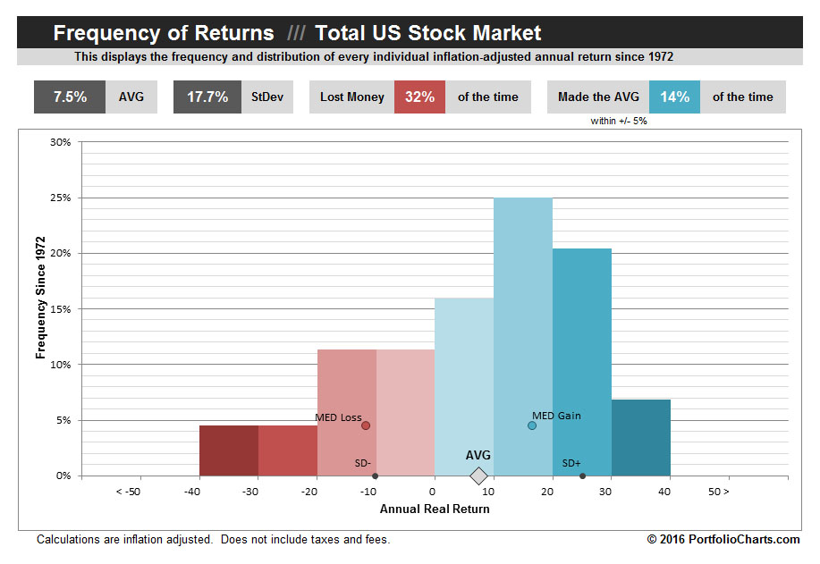
The correct answer is six times. Only 14% of the time has a total stock market investor received the average return they expected even within +/- 5%. It’s usually quite a bit more or less than that.
Next question:
How frequently since 1972 has the total stock market lost money in inflation-adjusted terms? Remember that this period includes one of the hottest bull markets in history through the 80’s and 90’s.
…
The correct answer is fourteen times. The stock market lost money about one out of every three years on average, and among those down years the typical (median) loss was about 12%.
If you got both of those questions right, I’m very impressed. While some people like to stop reading at the average and to project the 7.5% return every year into the future, most don’t realize that it’s actually very rare to make that average in any given year and that losing double digits in the stock market is not only common but also perfectly normal. The annual returns you experience in real life often are not at all like the averages you have dutifully studied, and it’s very likely your confidence will be shaken when it comes into conflict with your present-day experience and your rational instinct to fix the “problem”. It’s not emotion that causes everyone to sell low. Sometimes it’s simply the disconnect between expectations and reality.
Admittedly, that’s a tough nut to crack and a lot of it comes down to experience. However, in the spirit of helping people set realistic expectations, I’ve added a new calculator to the site. It’s called the Annual Returns calculator. Here’s an example for the total stock market:

At its core, the Annual Returns calculator is a histogram that sorts every individual inflation-adjusted return for a portfolio since 1972. Think of it as opening a jigsaw puzzle with hundreds of pieces and pouring it out on the table. At first it’s impossible to know where to start, so many people first sort the pieces by shape and color. With neatly sorted piles, it’s a lot easier to see the trends in the pieces. This same idea applied to individual annual returns allows you to easily visualize how often certain outcomes occurred.
Each column represents the count of each time a return falls into the bucket between the numbers at the bottom. (Any very high or very low returns off the chart will be caught in the first and last buckets.) For example, in the above example the stock market had an annual real return between 20 and 30 percent 20 percent of the time. Also, the stock market lost between 30 and 40 percent almost 5 percent of the time.
The average and standard deviation are not only displayed above the chart but are also mapped along the horizontal axis to help you see what those numbers actually represent in the grand scheme of things. Standard deviation is basically a measure of the relative width of this chart (the higher the number, the greater the volatility), although the math is based in statistics and would require a post of its own to explain in detail. Personally, I like this visualization for how it makes the true return extremes more transparent than the raw standard deviation number communicates. For the perfectly normal investor whose brain hurts with this kinda thing, just focus on the columns. Compare a few Annual Returns charts side by side, and the relative volatility will quickly become evident with no esoteric numbers required.
(As a side note, now that there’s a natural place to display the average and standard deviation where they make visual sense, you may notice that I’ve cleaned up the Pixel chart summaries and Funnel calculator to remove repetitive data.)
In addition, the Annual Returns chart includes the median gain and median loss to help provide a feel for what a typical good year and bad year looks like. Just as a technical matter, don’t read anything into the points floating up the Y-axis — that’s only to keep the text from overlapping with other points. Here you can easily see that the typical annual loss (when it does occur) is about -12%.
Beyond the normal histogram features, you can also find the two key stats we talked about earlier — the frequency that the portfolio hits the average, and the frequency it loses money. I find these data points really helpful for expectation setting in a potential portfolio. Don’t be tricked into thinking something is amiss when you inevitably don’t get the average return every year, and definitely don’t freak out when you occasionally lose money. That’s how investing works!
Truly understanding uncertainty in portfolio returns isn’t easy, but hopefully the Annual Returns chart will be a helpful tool in breaking down some of the barriers in your way. As a start, study all of the data on the chart and let it sink in how much of that information you miss out on when you only look at a single over-simplified average return or even a standard deviation number. As you browse portfolios or play with the calculator, look at how the Annual Returns charts differ and think about how you might react when your portfolio experiences returns on the leftmost extremes. They happened before and may happen again. Consider not only the end goal, but also the experience you’re signing up for.
Planning your long-term strategy based on the averages (preferably of the compound variety) is a great idea. But as you do, take the time to also test your short-term instincts based on the annual returns frequencies. You’ll be a smarter investor for the exercise, and you’ll be much better prepared for whatever investing future lies ahead.