While useful and accurate data is always my primary concern with Portfolio Charts, I spend way more time than you might realize creating the perfect visual design. Whether it’s selecting the ideal chart settings to make the data pop, finding just the right image to accompany a post, or iterating dozens or even hundreds of visual layouts to find the cleanest option, I’m always looking for ways to beautify each page.
One can certainly argue my design background contributes to my obsessiveness over each detail, but it runs a lot deeper than just wanting to create something easy on the eyes. I learned long ago that little visual choices really do matter. Like the bright aposematic colors that warn predators about the poison dart frog, eye-catching items often communicate very important information. So a truly beautiful design is way more than just skin deep.
You may notice several changes around the site lately including a fancy new logo, a revamped front page, and a new color scheme in the Portfolios page. While I admit I’m excited about how it all turned out, there’s definitely a strategic purpose to the effort. Some of it is subtle, like swapping out the front page image of me at a whiteboard with a collection of lots of different people because I prefer the first impression to be not of me as a virtual professor but of how you as an investor can benefit. But other design decisions like the portfolio color scheme are more direct and are central to how the site works.
So if you’re new to Portfolio Charts and are wondering what you’re looking at or even a long-time user who could use a primer, I think it would be informative to dig into the imagery and talk about the message in the colors.
If you’re browsing portfolios or building one for yourself in the many charting tools, one of the first things you’ll notice is the donut chart that represents each portfolio. For example, here’s the visual representation of the Rick Ferri Core Four.

That image is carrying quite a bit of information involving not only the assets but also their percentages. To explain, let’s step back and look at the individual asset types.


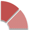
Every asset on the site generally falls into one of three high-level categories: stocks, bonds, and other real assets. I display stocks as red, bonds as green, and real assets as blue. Each category can then also be subdivided into two additional buckets for domestic and international assets. Dark solid colors represent domestic assets, while light cross-hatched colors represent international assets.
So going back to the Core Four, you can see that it contains domestic stocks, bonds, and real assets as well as a slice of international stocks. Futhermore, each slice is scaled to the percentage of the asset in the portfolio. So even without knowing the specific percentages, you can still get a pretty good idea of the general composition simply from a quick glance at the portfolio image.
For another example, let’s look at the 7twelve Portfolio.

This one has quite a bit more going on with multiple types of stocks, bonds, and real assets covering both domestic and international versions of each. So the image tells you right away that it takes a different approach to diversification than the Core Four portfolio. To understand each asset a little deeper, let’s look at the associated portfolio interface that generated that image.

Here you can find the exact percentages for each slice, and to make it easy to interpret they’re also color-coordinated with the donut chart. So no matter what portfolio you’re looking at or new idea you’re experimenting with, the tools are designed to make understanding portfolio construction as seamless as possible.
Pretty simple, right? Well there’s a big difference between simple and easy, and you have no idea how long that took to perfect. But I’m really happy with the results, not only for how it looks but also for how it works. It’s often said in the design industry that form follows function, but in my experience the best designs are more symbiotic than that. Beauty and utility are intertwined in the way we’re wired, and even when you can’t fully articulate it you know it when you see it.
That’s how occasionally when exploring colors to communicate assets in an Excel chart, a light turns on and things just fall into place.

Good design just works. And beyond the attractive exterior, I hope the new visual approach works for you and helps make portfolio research that much more educational, engaging, and intuitive.
If you love the new aesthetics, consider buying the designer a coffee.

